WhyMinds AI
Positioning an AI consultancy without saying the word 'synergy'.
- Role
- Design & build
- Client
- WhyMinds
- Year
- 2026
- Stack
- Next.js · Tailwind
- Status
- Live
What was broken
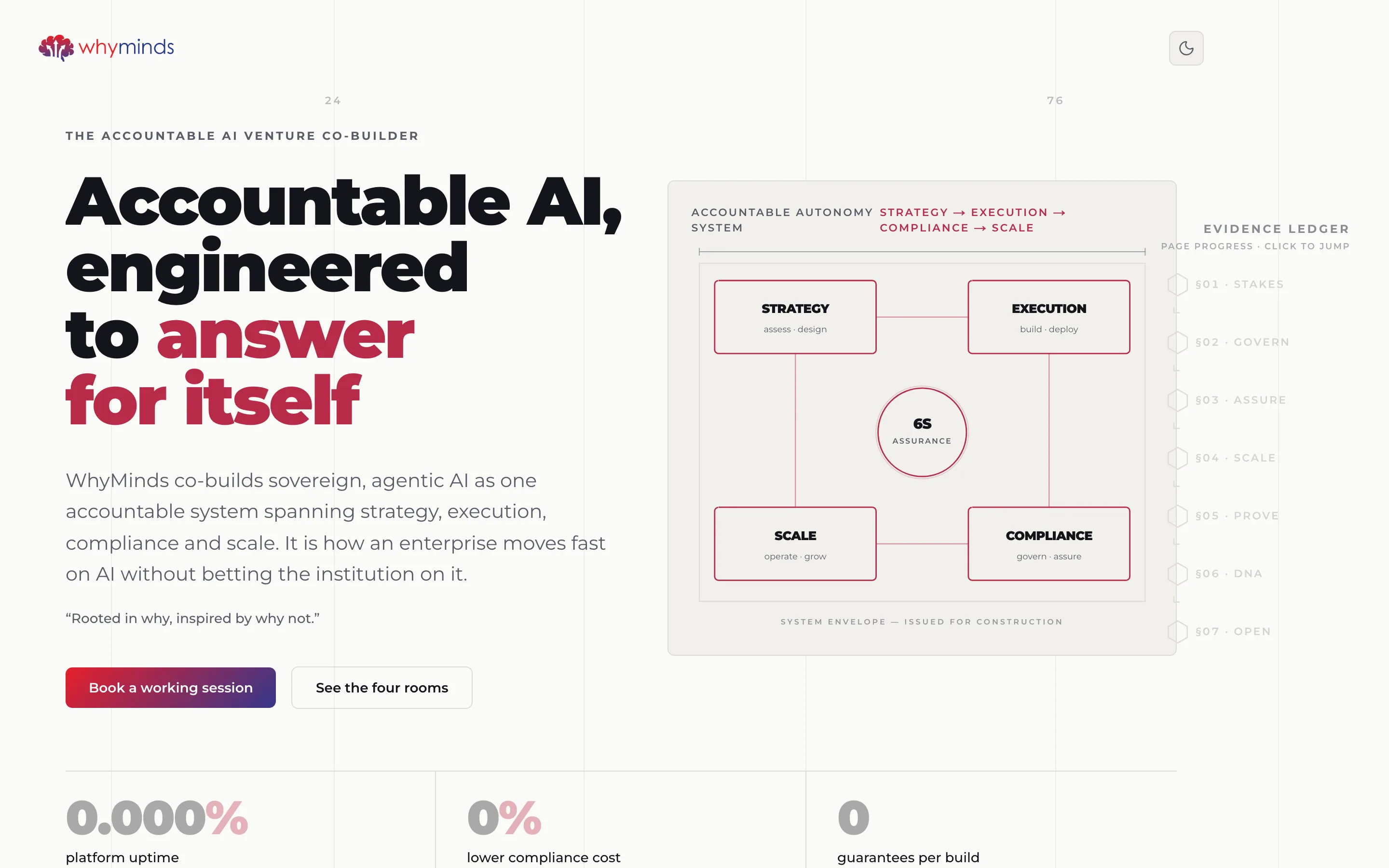
WhyMinds co-builds AI ventures with enterprises, and the entire pitch rests on governance — sovereign, auditable, accountable. Every competitor's site says the same words in the same gradient-and-glow template.
What made it hard
The buyer is a CIO who has been pitched AI eleven times this quarter and has stopped reading the copy. Nothing written on the page was going to differentiate it, because everyone writes the same page.
What I decided
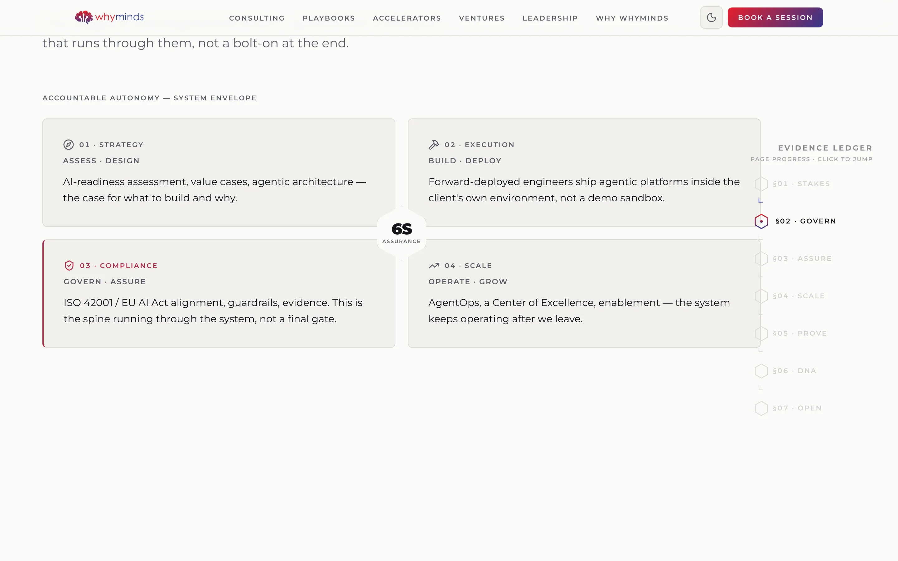
Argue the position through the layout instead. Build the site as an engineering drawing — visible grid, column numbers, section marks, an issued-for-construction sheet note — so discipline is the first thing you perceive and the copy only confirms it.
What shipped
Next.js and Tailwind, an SVG schematic of the four-room system, a section-mark rail doubling as page navigation, scroll-triggered counters, and two fully designed themes.
The moment it worked
The drawing-sheet framing did the differentiating. It's the one AI consultancy page in the set that doesn't look like the others, and it earns that in the first second, before the reader has decided whether to care.
What it left behind
The schematic became how they explain the company — it's the slide now, not just the hero.
How it looks, and why
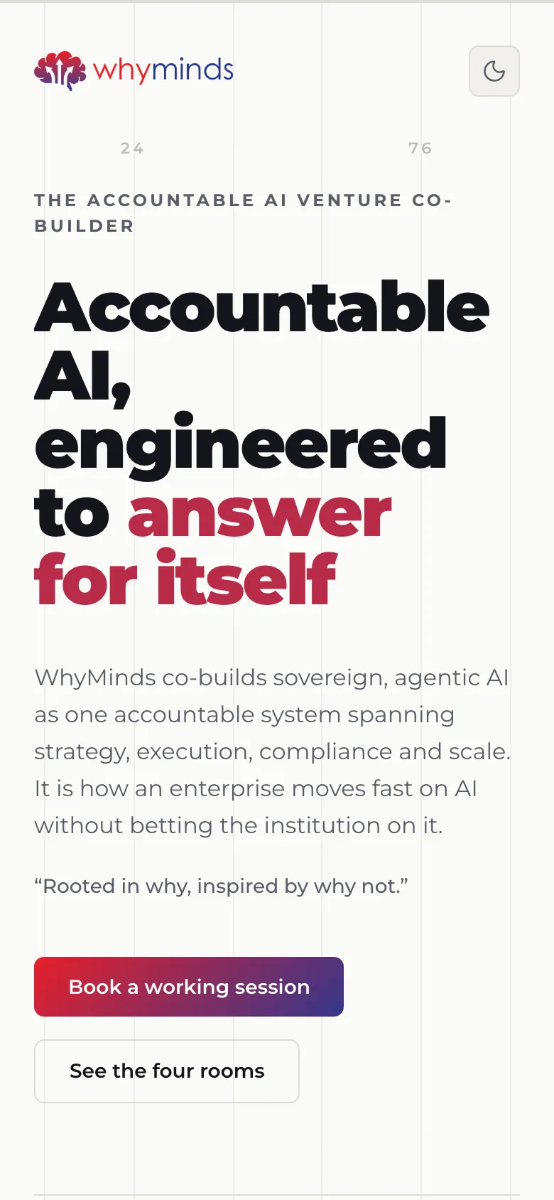
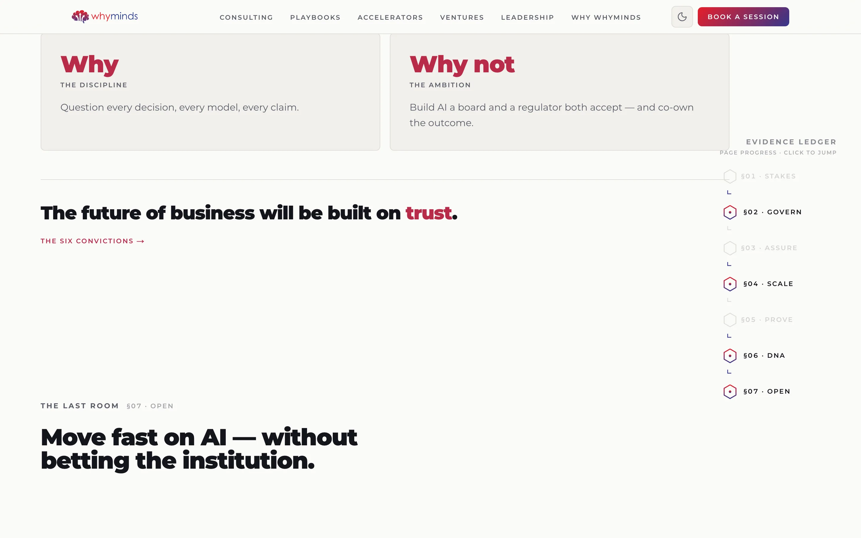
An AI consultancy selling accountability can't look like an AI consultancy. So the whole site is an engineering drawing: a visible column grid with its numbers in the margin, section marks §01–§07 down the right as a page-progress ledger, and a sheet note that reads ISSUED FOR CONSTRUCTION. A heavy geometric sans carries the headline, crimson lands on exactly the clause being argued, and the four-room system diagram is drawn as a schematic rather than illustrated as a graphic. It signals discipline before a word of copy is read.
Palette — sampled from the live site- Next.js
- Tailwind
The four-room diagram
Strategy, Execution, Compliance and Scale drawn as one connected system with assurance at the centre — the offer explained in a glance instead of four paragraphs.
Evidence ledger rail
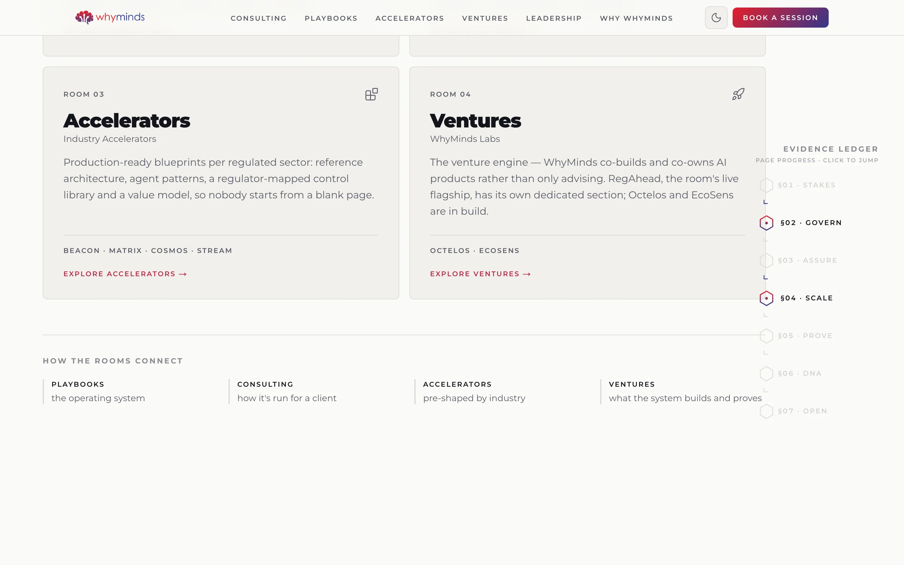
§01–§07 pinned to the right edge as both progress indicator and jump navigation, so a long argument stays navigable.
Counting stats that start at zero
0.000% uptime, 0% compliance cost, 0 guarantees — figures that resolve on scroll and make the claim land as a number, not an adjective.
Light and dark, both designed
A drawing-sheet light theme and a full dark theme, each with its own grid treatment rather than one inverted.