Merveille Pâtisserie
A patisserie storefront where the product had to look as good as it tastes.
- Role
- Design & build
- Client
- Merveille
- Year
- 2026
- Stack
- Next.js · Supabase · Tailwind · GSAP · React Three Fiber
- Status
- Live
What was broken
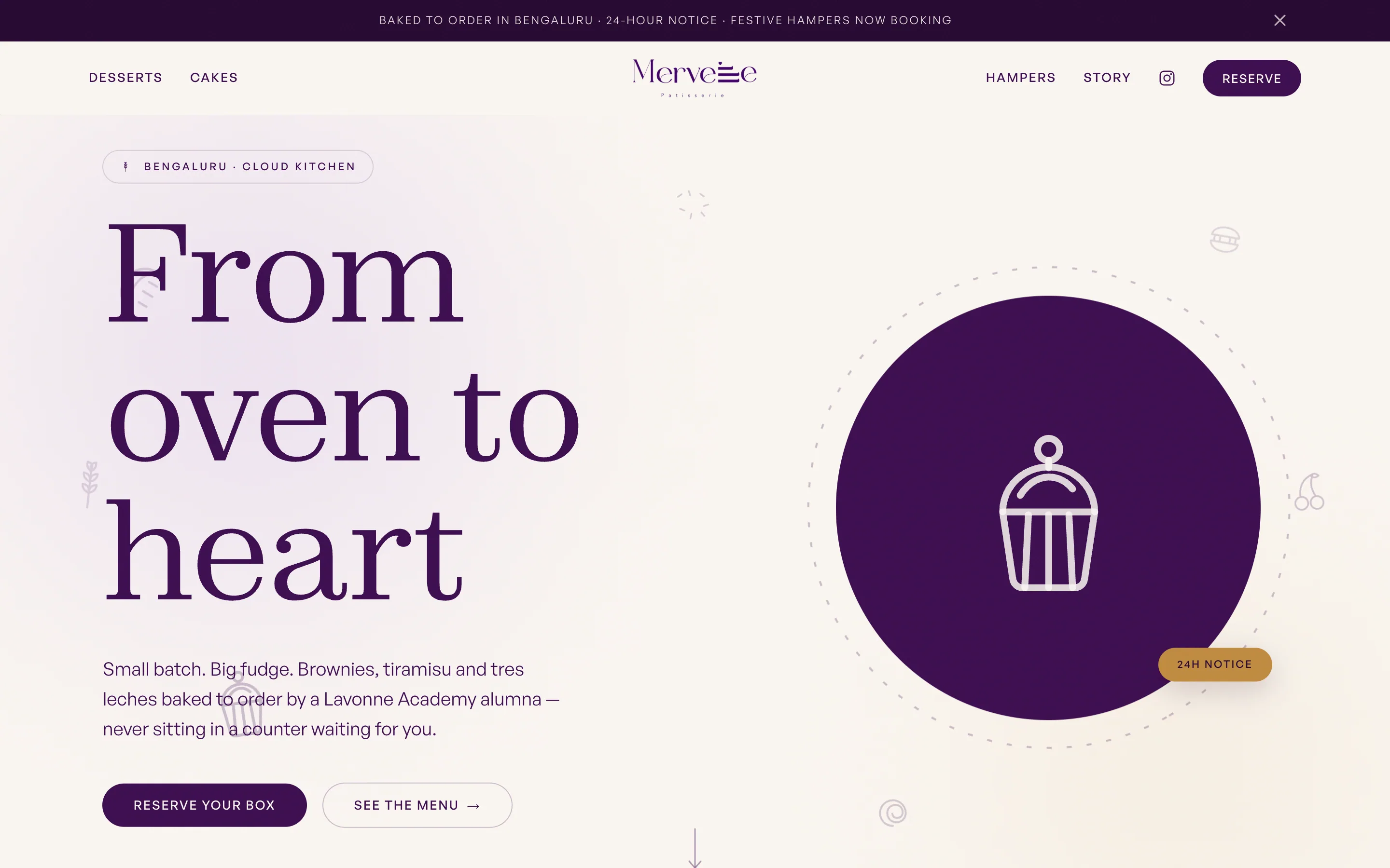
Merveille bakes out of a cloud kitchen in Bengaluru — no counter, no window, nothing for a customer to walk past. Instagram was doing all the selling, which meant the business was legible for about six hours and then gone.
What made it hard
There was no product photography worth putting at 2000px, and no stock to sell — everything is made to order on 24 hours' notice. A normal storefront layout would have been mostly empty boxes and a checkout button that lies.
What I decided
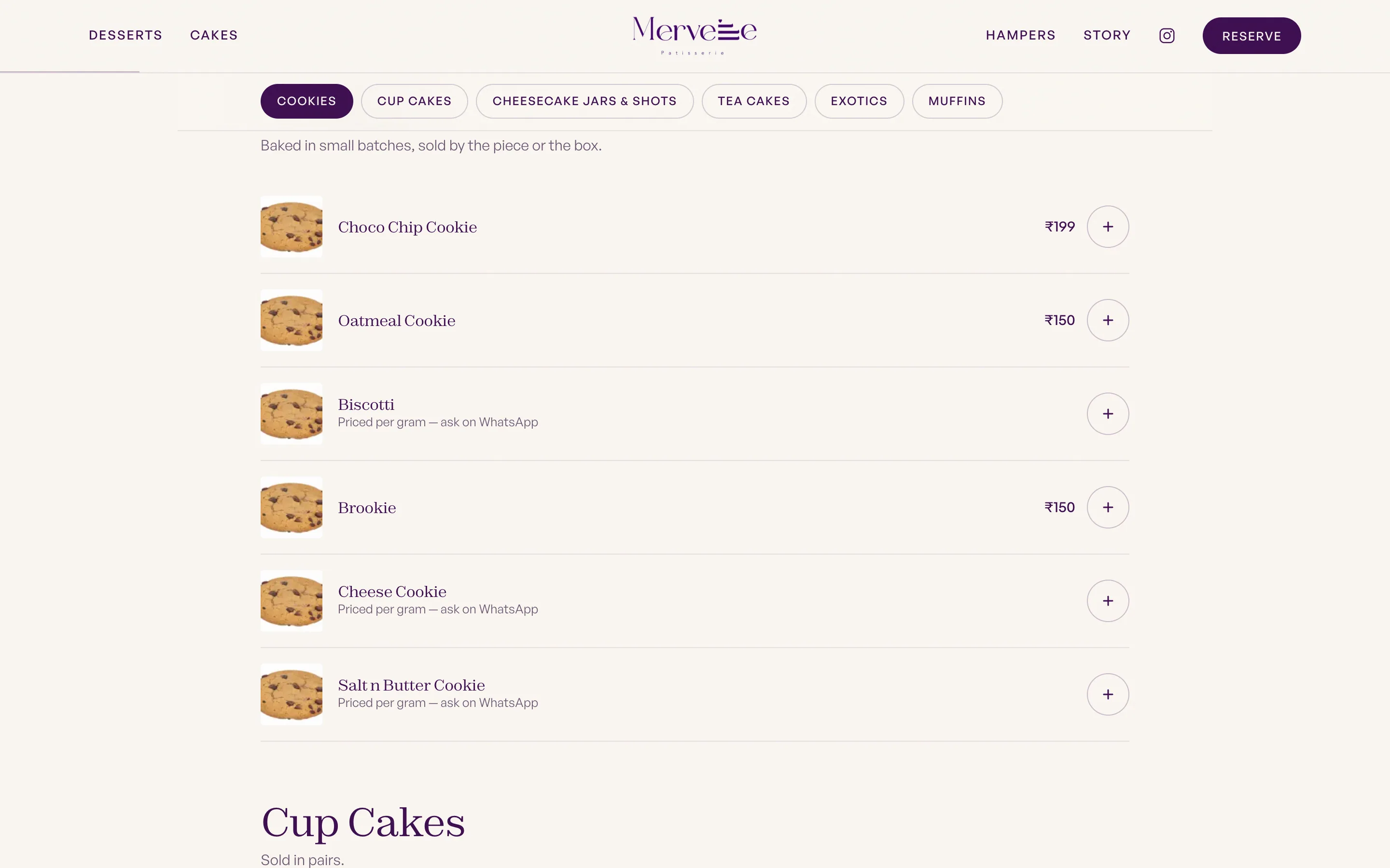
Build the brand instead of the catalogue. One drawn icon per dessert, a serif that reads like a patisserie box rather than a food app, and a reservation flow that's honest about the lead time instead of hiding it at checkout.
What shipped
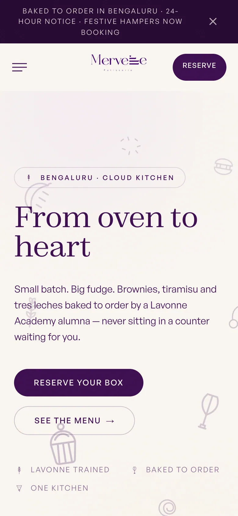
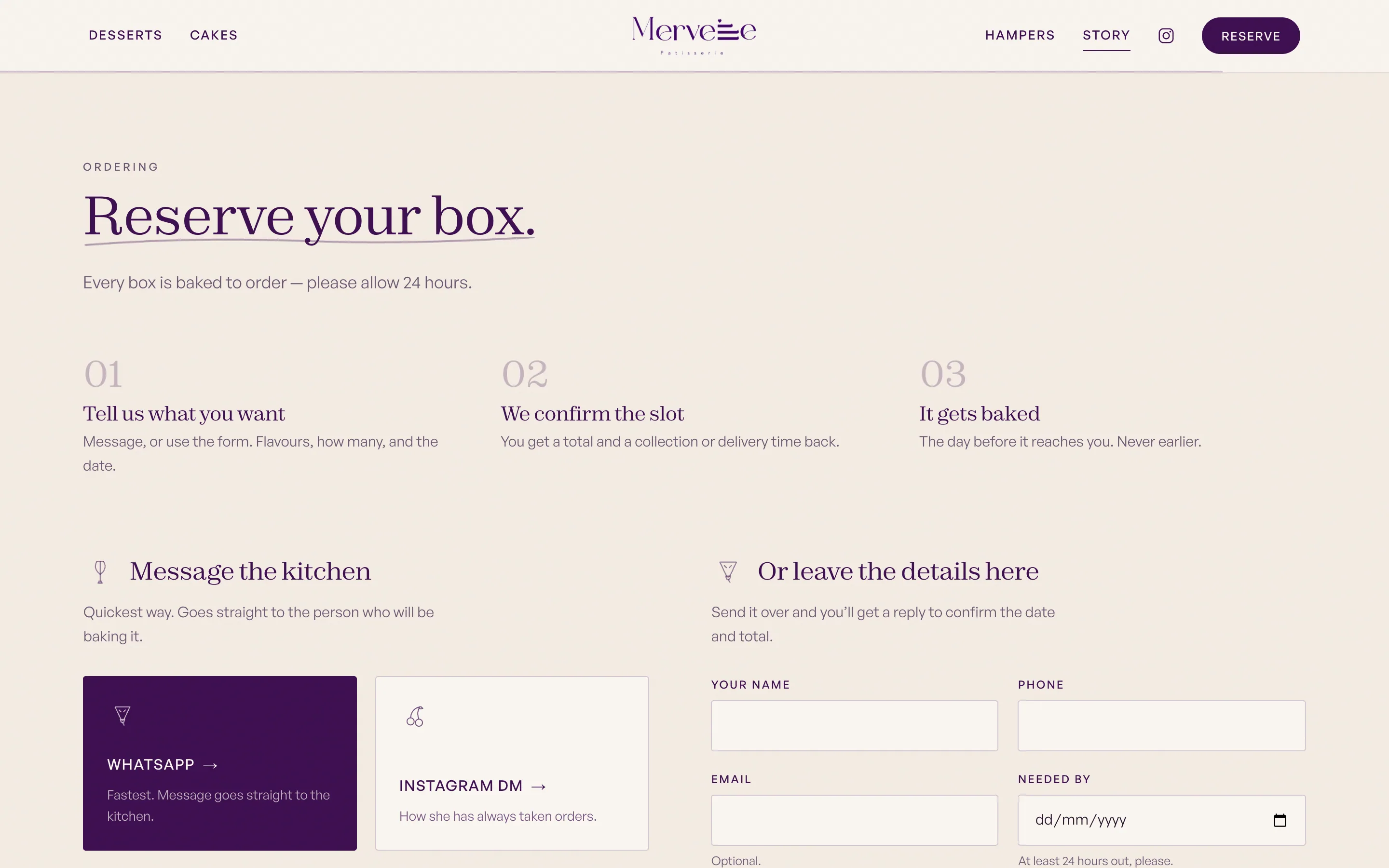
A Next.js storefront on Supabase: tiled menu by category, hampers section, story page, a box you add things to, and a reserve flow with the 24-hour notice stated in three places before you commit to it.
The moment it worked
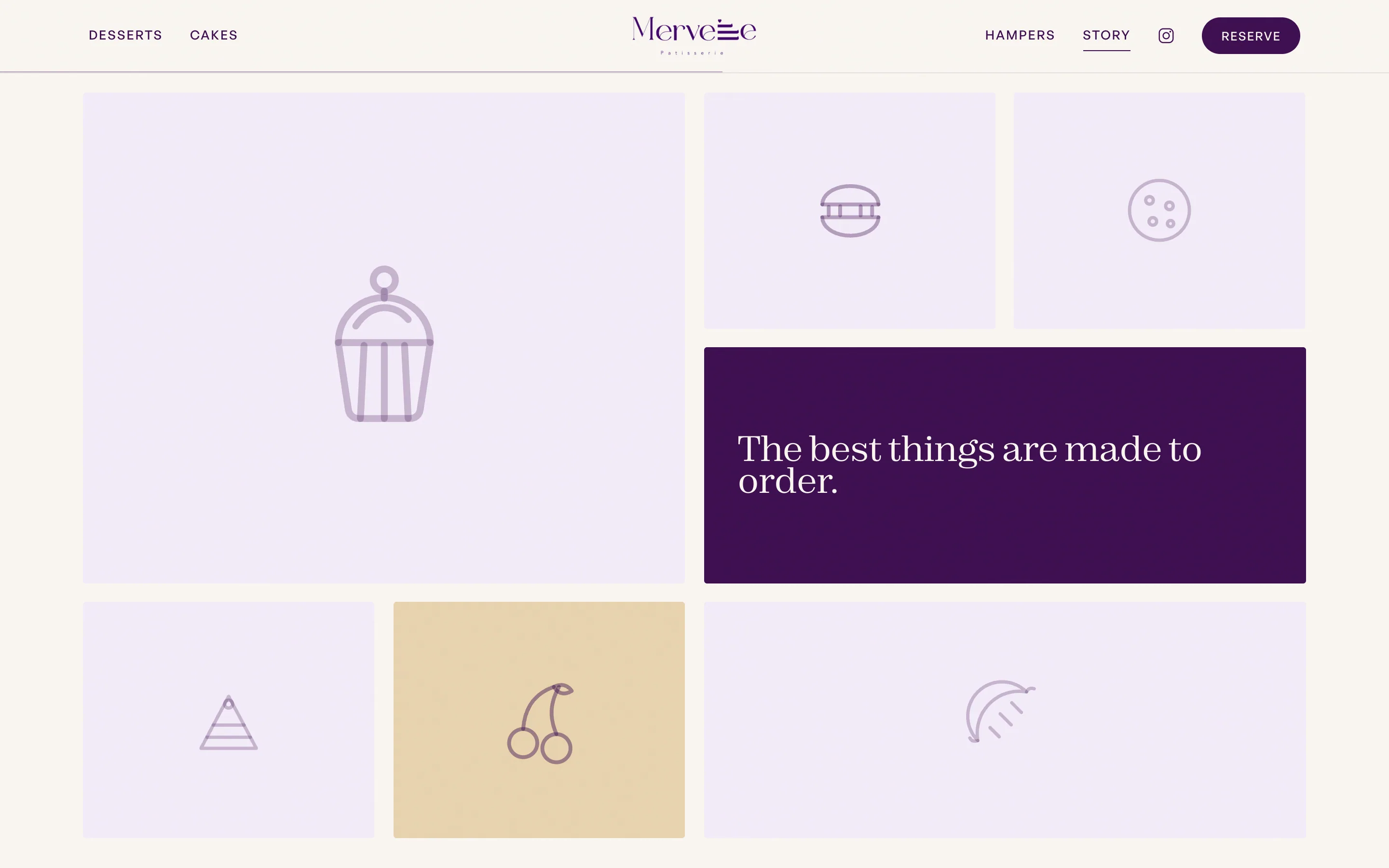
The moment the icon system landed the page stopped looking unfinished. Without a single photograph it reads as a real patisserie — which is the whole point of a brand doing work photography can't.
What it left behind
She can put the season's hampers at the top of the page herself, and when the photos are finally shot they drop into tiles that are already the right shape.
Then the orders wanted to be a conversation
A form is the wrong shape for a made-to-order kitchen. Half the menu is priced per gram, most orders come with a question — can you do it eggless, can it say a name on it, can I collect at eight — and none of that survives a Submit button. So WhatsApp became the primary channel: the order button opens a chat with the message already written, addressed to the person who will actually bake it. The form is still there for anyone who prefers it; it just isn't the loudest thing on the page any more.
And she stopped needing me to change anything
Products, prices, festive hampers, the WhatsApp number itself and the order ledger all moved behind a magic-link admin. Every collection renders from one config file through one generic form, so adding a content type is a few lines rather than a screen. The number matters most: until it's set, every order button quietly falls back to Instagram — the site never shows a channel that isn't answered.
How it looks, and why
A cloud kitchen has no shopfront, so the site is the shopfront. Aubergine and cream do the patisserie-box work, a high-contrast serif carries the headline while the body stays in a plain sans, and gold appears exactly once per screen — on the thing you're meant to click. The product photography wasn't ready, so the whole visual language is line-art desserts on lilac tiles: it holds the page together now and gets out of the way the day real photos land.
Palette — sampled from the live site- Next.js
- Supabase
- Tailwind
- GSAP
- React Three Fiber
WhatsApp is the checkout
The primary order button opens WhatsApp with the message already written, addressed to the person who does the baking. It's how orders were already being placed, so the site stopped fighting it.
Reserve, not checkout
Everything is baked to order on 24 hours' notice, so the flow books a slot instead of pretending there's stock on a shelf.
Menu as a tiled grid
Desserts, cakes and hampers laid out as mixed-span tiles with a quote block cut into the grid — browsable without a single product photo.
Channels that hide themselves
Instagram, Swiggy and Zomato buttons only exist once there's a link behind them. An order button that goes nowhere is worse than no button.
Her own admin
Products, prices, hampers, the WhatsApp number and the order ledger all live behind a magic-link login. One generic form renders every collection, so a new content type is one entry in a config file.
Standing notice bar
Lead time and current bookings sit above the nav, because the one question every order brings is 'when can I get it'.